STUDIO BAROT
Otacon
Otacon
Otacon is an agency that provides operations support and business solutions for companies of all sizes. Their work centers on clarity, efficiency, and systems thinking; helping organizations operate smoothly and scale with confidence.
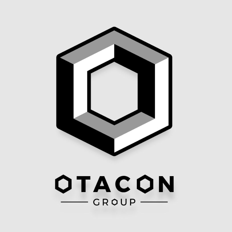
They approached us to create a logo that felt strong, modern, and unmistakably industrial. The direction called for a monochrome palette, a sense of dimensional structure, and a distinct “O” icon that could stand alone across various brand touchpoints.
The final design features a geometric, three-dimensional “O” built with bold forms and shaded facets. This industrial-inspired shape communicates stability, strength, and precision — qualities that reflect Otacon’s approach to operational excellence. Paired with a clean, modern wordmark, the identity delivers both versatility and striking visual presence.


